
Those of you who have checked our new post series about “Merlin report templates” know by now…
- How to modify existing reports
- How to edit description or report template names
- How to create your own report templates
- How to localize a Merlin report template
- Further tips for localizing an xslt report template
- How to add an option in an xslt report template
- How to add an option in a python / wbl report template
- How to add a property into an existing xslt report
- How to add a property into an existing python /wbl report template
Now let’s do some magic with the reports.
- Map a status or flag information to a graphic file
- Define the size of the project image over the options
- List overdue tasks along with the next activities, in “Next Due Activities” report
- Report planned, actual and planned vs actual work per phase in a chart
- Report expected work costs per role for your resources
- Report expected work costs per resources’ group
- Report the project’s name in the Next Due Activities report
- Modify the “Milestone Trend Report” to show the WBS in the table and in the chart
- Report expected or actual resources’ work per phase
- Report resources work cost per phase
- Report cash flow for expected cost or approved budget
- Report billable costs entered on elements
- Report element costs by type
- Report issues
- Report Events
- Output Project’s WBS
- Resources Time allocation to various tasks and subtasks
- Calendar View
- Working hours distributed in time per resource and assignment
- Work Chart
Work Chart
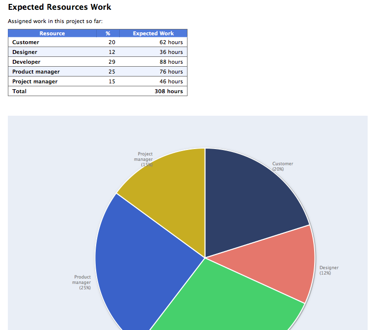
If you like to report  expected or actual working hours per resource in a chart and/or table, this is a custom report doing so.
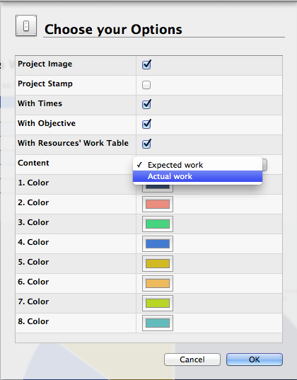
You may check contained ‘WorkChart.py’, “WorkChart.wbl” to see how we iterate in project’s master resources, ask for their working units, compare them with total work hours and output this information in the table. In the pie chart, working hours are forwarded and the pie chart calculates respective percentages. There are methods in the Python part gathering the x- and y-Ticks and some javascript functions drawing the graph. You may furthermore disable outputting resources’ work in the table and define the first 8 colours to be used for the pie chart.
Feel free to modify this custom report further as you require for your needs.
An output sample:
Showing expected work hours by resource.
And the report options:
Installation:
- Extract the zip first
- place the contained mrept package under the following path of your mac: ~/Library/Application Support/Merlin/Reports
- (in case you have no “Reports†folder please create it first and pay attention to name it exactly as “Reportsâ€)
- restart your Merlin and
- call File > New Report… to find the new report called “Work Chart”.
Pingback: Merlin – Do a bit of magic in reports – PART XXI » MacPM
Pingback: Merlin – Do a bit of magic in reports – PART XXII » MacPM
Pingback: Merlin – Do a bit of magic in Merlin reports – PART XXII » MacPM
Pingback: Merlin – Do a little bit of magic in Merlin reports – part XXIV »
Pingback: Merlin – Do a little bit of magic in Merlin reports – part XXVII | MacPM