Merlin – Do a bit of magic in Merlin reports – PART XXIII

Those of you who do project management with Merlin on your Mac  and have checked our post series explaining how to create custom templates for Merlin reports, know by now…

Now let’s do some magic with the reports.


URLs report

Merlin for Mac OS X allows you to attach elements onto your project structures to keep track of additional information. As you probably already know, you can use 5 element kinds; events, files, information, issues, risks or checklists.

On some kinds of elements you may record among other project related data also URLs.

This report outputs all URLs recorded in [the elements of] your project. The report uses standard techniques explained in previous posts to filter for project elements containing following valid URL prefixes, i.e.  ‘http://’ or ‘file:///’.

Iterates those elements and shows its URL, element  and item item.

Please remember: Custom Merlin reports we provide as templates, can be downloaded and used for free. Furthermore, you may modify and distribute as you like and find appropriate.

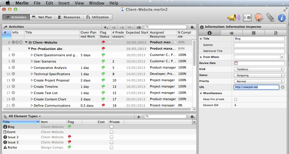
URLs in a sample project in Merlin:

URLsInMerlinElement

An output sample:
Continue reading
Merlin – Do a bit of magic in Merlin reports – PART XXII

Those of you who do project management with Merlin on your Mac  and have checked our post series explaining how to create custom templates for Merlin reports, know by now…

Now let’s do some magic with the reports.


Resource Groups’ or Roles’ Units Utilization Distribution

The resources of a project you plan with Merlin for Mac OS X may be grouped by role or resource group. If you want to know how many of your resources are scheduled as a time distribution, this custom report is implemented to output it in a table and plot it as a line chart.  The report uses standard techniques explained in previous posts to iterate in project’s date intervals, asks the project resources’ groups or roles, iterates in their assignments and calculates the amount of resources as a function of time.

In the report options you may select whether you want to output groups or roles and select a color for the line chart plotted for the totals.

Please remember: Custom Merlin reports we provide as templates, can be downloaded and used for free. Furthermore, you may modify and distribute as you like and find appropriate.

An output sample:

output

Available options… Continue reading

Merlin – Do a bit of magic in Merlin reports – PART XXII

Those of you who do project management with Merlin on your Mac  and have checked our post series explaining how to create custom templates for Merlin reports, know by now…

Now let’s do some magic with the reports.


Complete vs Expected Complete % Analysis

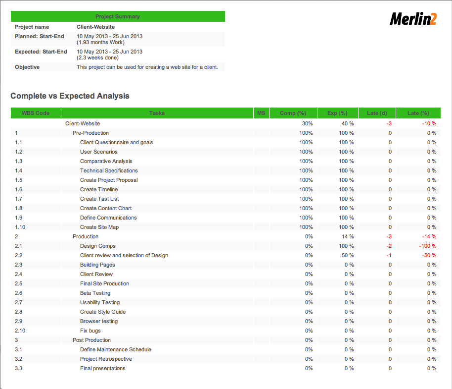
Merlin color codes tasks automatically according to their scheduling. If they are behind schedule they are shown red. If they are in progress and in time they will be colored yellow. Tasks which are completed are green, and non yet started tasks planned on future dates are blue. Merlin also calculates the overall progress of your project and you can compare this with the time line to see how much behind, or a head you might be currently. It does not provide however a column showing the expected complete percentage or the current deviation from it. This Merlin report was originally implemented by me and uploaded here to output such information by project, activity group, task and/or assignment. There was however an issue found by Marco Jorge (a Merlin user) with the created template. Marco corrected the issue and added some more options for the output, he also chosen to change the usual bluish colors in the css and used a greenish scheme.

Please see contained methods in ‘MERComplete.py’ if interested in finding out exactly how expected complete % is calculated (iterating all sub activities or assignments of a task based on the expected start of the task or project and the current date). There is an option for the numbering, so you can view the # or WBS code if you like. The flags are implemented as explained here and Marco added an option to disable them if not needed. Should you require other colors for the deviation, simply check and modify the colors for styles red, green and neutral in the Style.wbl and PrintStyle.wbl files.

Many thanks to Marco for providing this modified report template.

Remember: The custom Merlin reports provided on our blog as templates, can be downloaded and used for free.

An output sample:

reportSampleOutput

Available options… Continue reading

Merlin – Do a bit of magic in Merlin reports – PART XXI

Those of you who have checked our new post series about “Merlin report templates” know by now…

Now let’s do some magic with the reports.


Information report with hierarchy

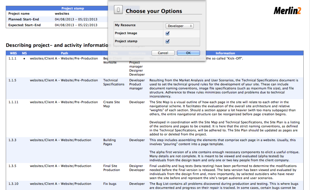
Merlin contains a report template outputting notes entered on the activities of a project as a flat list. We’ve modified this existing report template to output tasks showing their hierarchy which makes easier to read.

You may check contained ‘Report.xslt’s in German and English.lproj folders to see how we iterate in project’s projects and then get their activities level by level. In the report template we’ve included a space.png which we use to indent the titles row by row according to their level.

Feel free to modify this custom report further as you require for your needs.

An output sample:

Showing information for a master project.

sample

Or by a selected resource…SampleOutputForResource Continue reading

Merlin – Do a bit of magic in Merlin reports – PART XX

Those of you who have checked our new post series about “Merlin report templates” know by now…

Now let’s do some magic with the reports.


Work Chart

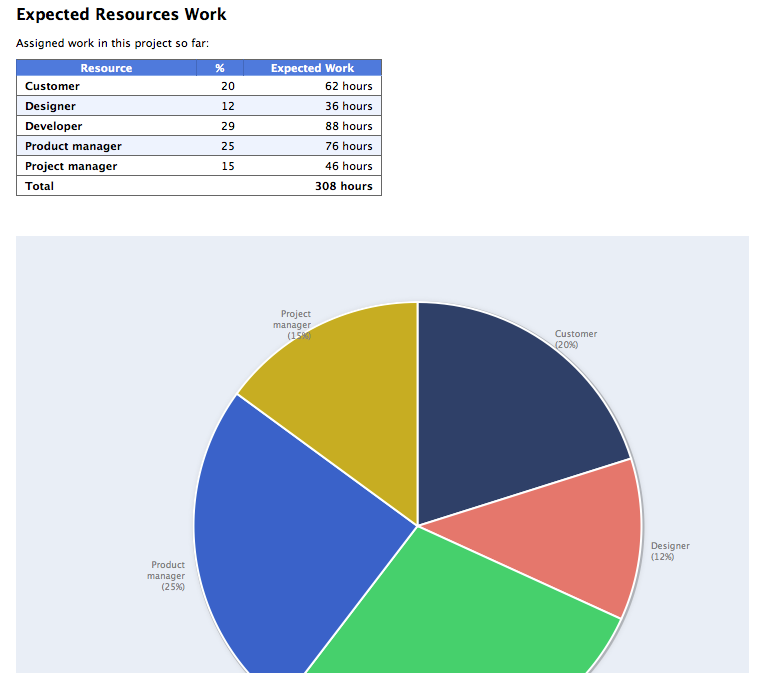
If you like to report  expected or actual working hours per resource in a chart and/or table, this is a custom report doing so.

You may check contained ‘WorkChart.py’, “WorkChart.wbl” to see how we iterate in project’s master resources, ask for their working units, compare them with total work hours and output this information in the table. In the pie chart, working hours are forwarded and the pie chart calculates respective percentages. There are methods in the Python part gathering the x- and y-Ticks and some javascript functions drawing the graph. You may furthermore disable outputting resources’ work in the table and define the first 8 colours to be used for the pie chart.

Feel free to modify this custom report further as you require for your needs.

An output sample:

Showing expected work hours by resource.

sample

And the report options: Continue reading