Those of you who do project management with Merlin on your Mac and have checked our post series explaining how to create custom templates for Merlin reports, know by now…
- How to modify existing reports
- How to edit description or report template names
- How to create your own report templates
- How to localize a Merlin report template
- Further tips for localizing an xslt report template
- How to add an option in an xslt report template
- How to add an option in a python / wbl report template
- How to add a property into an existing xslt report
- How to add a property into an existing python /wbl report template
Now let’s do some magic with the reports.
- Map a status or flag information to a graphic file
- Define the size of the project image over the options
- List overdue tasks along with the next activities, in “Next Due Activities” report
- Report planned, actual and planned vs actual work per phase in a chart
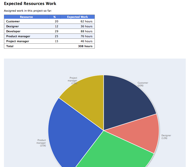
- Report expected work costs per role for your resources
- Report expected work costs per resources’ group
- Report the project’s name in the Next Due Activities report
- Modify the “Milestone Trend Report” to show the WBS in the table and in the chart
- Report expected or actual resources’ work per phase
- Report resources work cost per phase
- Report cash flow for expected cost or approved budget
- Report billable costs entered on elements
- Report element costs by type
- Report issues
- Report Events
- Output Project’s WBS
- Resources Time allocation to various tasks and subtasks
- Calendar View
- Working hours distributed in time per resource and assignment
- Work Chart
- Information report with hierarchy
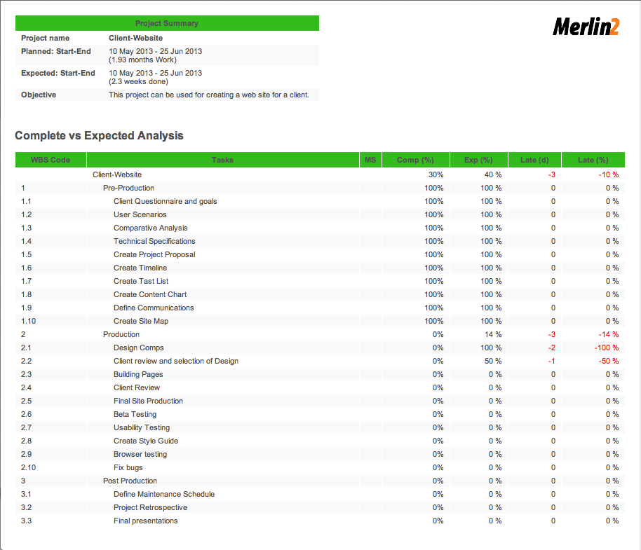
- Complete vs Expected Complete % Analysis
- Resource Groups’ or Roles’ Units Utilization Distribution
- URLs report
URLs report
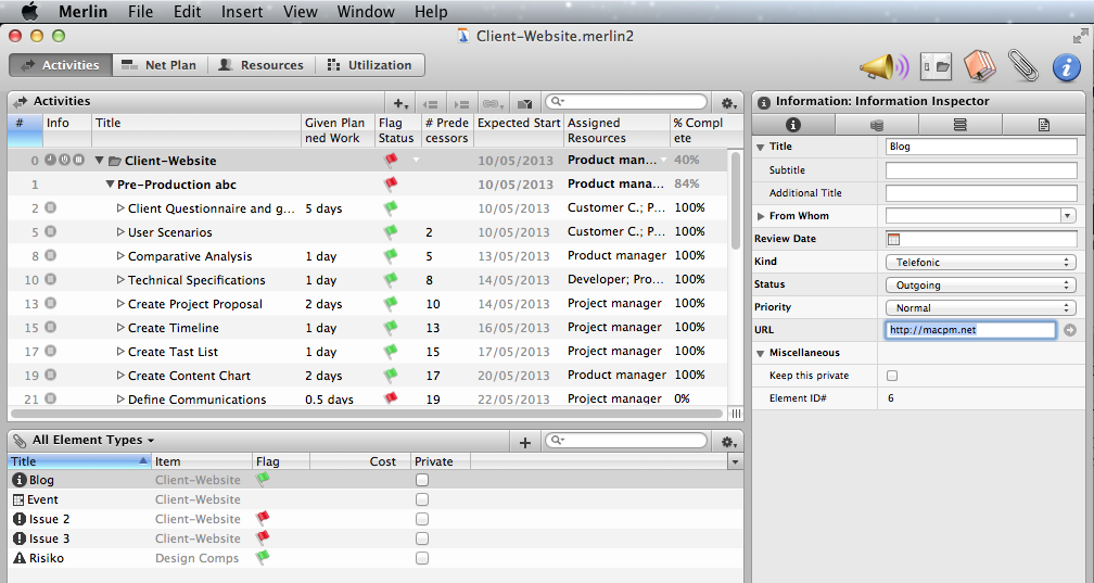
Merlin for Mac OS X allows you to attach elements onto your project structures to keep track of additional information. As you probably already know, you can use 5 element kinds; events, files, information, issues, risks or checklists.
On some kinds of elements you may record among other project related data also URLs.
This report outputs all URLs recorded in [the elements of] your project. The report uses standard techniques explained in previous posts to filter for project elements containing following valid URL prefixes, i.e. Â ‘http://’ or ‘file:///’.
Iterates those elements and shows its URL, element  and item item.
Please remember: Custom Merlin reports we provide as templates, can be downloaded and used for free. Furthermore, you may modify and distribute as you like and find appropriate.
URLs in a sample project in Merlin:
An output sample:
Continue reading